
ORDOLINE ALIGNERS
PROJECT TYPE:
DIGITAL COMMERCIAL
CLIENT:
ORDOLINE
ORDOLINE ALIGNERS
PROJECT TYPE:
DIGITAL COMMERCIAL
CLIENT:
ORDOLINE
PROJECT OVERVIEW
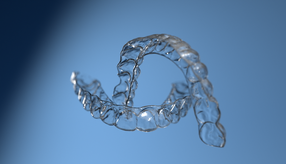
"Ordoline Aligners" is a 3D product animation we created for Ordoline, built around a single creative direction: letting the product exist on its own terms. Rather than constructing a narrative around the aligners, the animation places them in an open, minimal environment and allows movement, light, and detail to communicate the product's quality without distraction.
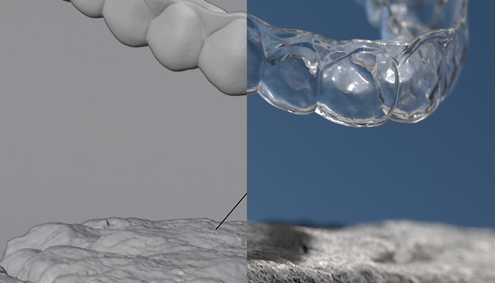
The project began with a thorough analysis of Ordoline's existing visual campaigns. The goal was not to depart from their established aesthetic but to work within it and push it forward - honoring the brand's visual identity while elevating the execution to a higher level. From initial concepts and styleframes through lighting tests and final renders, every decision was made in service of that balance.
The aligners float freely through the frame, creating a sense of weightlessness that removes any clinical association and replaces it with something closer to a sculptural object in motion. Close-up sequences give individual surfaces, edges, and reflections their own moment - treating product animation not purely as motion but as a series of frames that hold up on their own.


KEY FEATURES
Floating product direction: Aligners presented in open, unanchored space, using free movement to shift focus entirely onto form and detail.
Brand elevation: Built on a close study of Ordoline's previous campaigns, developing the visual identity forward rather than replacing it.
Minimal environment: A clean, open setting with deliberate negative space that keeps all attention on the product throughout the sequence.
Detail-driven close-ups: Dedicated frames highlighting reflections, surface edges, and material texture - designed to stand independently as visual assets.
Lighting as a tool: Lighting developed through iterative testing to bring out the translucency and surface qualities specific to aligner material.
Considered pacing: Motion choreographed to give the product room to exist without rushing through angles or transitions.


THE IMPACT
Dental aligners are clinical objects. The challenge in presenting them visually is removing that association without misrepresenting the product. By placing the aligners in a calm, open environment and letting movement and detail do the work, this animation repositions the product as something considered and well-made. For Ordoline, it functioned as a social media asset that fit naturally within their established presence while raising the visual standard, giving their audience a reason to stop and engage with a product they might otherwise scroll past.
VISIT US
A. Juozapavičiaus g. 6, Vilnius, 09311
©2025 NR3.STUDIO
JOIN OUR NEWSLETTER
Leave us with your email to get updates from the studio.