

NO PANIC EVENTS
PROJECT TYPE:
BRANDING
CLIENT:
NO PANIC EVENTS MANAGEMENT AGENCY
NO PANIC EVENTS
PROJECT TYPE:
BRANDING
CLIENT:
NO PANIC EVENTS MANAGEMENT AGENCY
PROJECT OVERVIEW
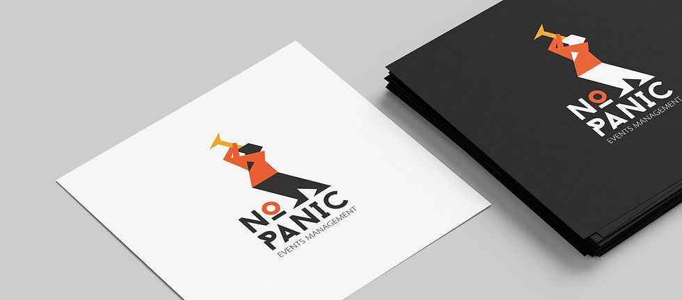
The visual identity for NoPanic, an events management agency, was developed by integrating a series of expressive pictograms. These stylized icons, based on a unified character system, convey movement, celebration, and diverse cultural experiences through bold, simplified forms.
The logo combines the agency name with the figure of a trumpet player, one of the signature pictograms, establishing an energetic and dynamic brand presence. This core symbol can be adapted across applications, while other icons from the series serve to represent different event types or organizational divisions. Whether used on posters, merchandise, or staff uniforms, each icon brings a sense of vitality, reflecting NoPanic’s commitment to vibrant, inclusive public experiences.
The pictograms draw inspiration from ancient visual storytelling traditions, such as Egyptian art. This influence is evident in the reduction of detail, use of abstract shapes, and emphasis on readable gestures. Applied consistently, the system supports a flexible yet cohesive brand universe that feels both playful and professional, with a color palette grounded in warm tones of black, red, and orange to evoke celebration, energy, and warmth.


KEY FEATURES
Logo is rooted in a custom pictogram series, centered on a trumpet-playing character, symbolizing festivity and energy.
Adaptable icon system used across formats - posters, uniforms, flags, and more - to reflect different types of events and activities.
Unified visual language inspired by ancient iconography and modern minimalist design principles.
Warm, high-contrast color palette for maximum visibility and emotional impact.
System built for flexibility and expansion, allowing future use across new media or agency departments.
Designed for both clarity and character, balancing professional identity with creative freedom.
Icon-as-narrative approach, turning branding into storytelling by letting each icon visually "speak" about its respective event or role.


THE IMPACT
VISIT US
A. Juozapavičiaus g. 6, Vilnius, 09311
©2025 NR3.STUDIO
JOIN OUR NEWSLETTER
Leave us with your email to get updates from the studio.